Selected work and explorations
Aēsop
A post-purchase order tracking experience when a user returns to the site.
This reduced operational load during peak, festive period. Customer Service contacts went down by 50% in Asia, and 11% globally in the first 3 months of launch.


Aēsop
A proposed stock management system prototyped against the current setup to reveal operational gaps and risks to revenue, brand, and customer trust.
The work strengthened a 2.6M AUD funding proposal and was recognised for combining data, insights, and research into a customer-centric, creative solution to operational hurdles.

What
Customers encounter stock unavailability across channels despite stock being available within Aesop’s inventory
So what
-
Negative effect on customer satisfaction, retention and brand perception.
-
Loss of revenue due to online order cancellations, product substitution at stores
Current

Now what
-
Meet online and offline demand regardless of inventory location, ownership, or status
-
Visibility across all inventory sources to view, manage, and allocate stock
Proposed

Store Locator

Product Detail Page

Checkout - Store Locator
Amazon
A redesigned card payment flow for first-time digital payment users in India, where 50% of eBook purchases relied on card payments.
I flagged blind spots in the purchase experience that were quietly degrading conversion, and redesigned for efficiency, trust and clarity. These improvements drove a 12% increase in card payment method conversion rate while keeping overall purchase success rates stable.

State / Filled

State / Empty

State / Default

Card number

Card expiry date
Grab
A driver payment-collection experience that began as a minor fix and evolved into a deeper inquiry into fairness, trust, and ergonomics.
I expanded the scope to uncover how policies shape equilibrium between riders and drivers, testing prototypes with drivers in Singapore’s parking lots. The work clarified Grab’s role as a policy-maker and led me to design with my phone mounted to a holder, just like in a vehicle.
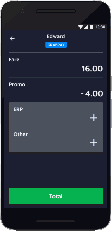
Do the math for the driver

Accommodate varying text length and format for localization
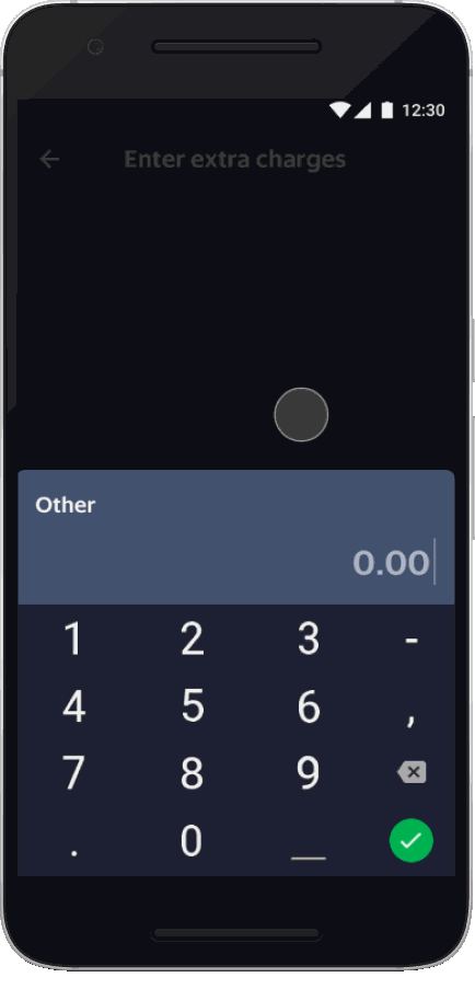
Make errors and warnings apparent
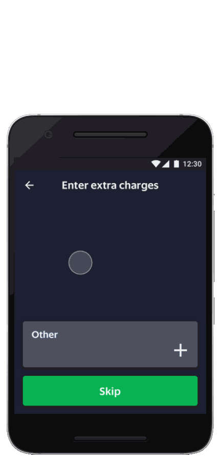
Design for all device sizes
Grab
A booking nudge for low-fare moments, now a permanent feature in the Grab app
I identified a blind spot in Grab's fare messaging. Riders were only alerted when fares were surging, and not when they were lower than usual. I proposed and designed a low-fare indicator to nudge bookings when driver supply exceeded rider demand. The feature still exists on the app today.

Redmart
A grocery browsing and filtering redesign after the product range doubled
Explored how filtering, sorting, and navigation support high-frequency shopping. Improved filter usage by 5x and basket size by 13% in 6 weeks. Gained a deeper understanding of online grocery as e-commerce on expert mode, where small frictions multiply.
The filter bar (combined with the nav bar) remains visible even as users scroll down

Both filters and results are displayed concurrently for instant visual feedback

Truncated options to enables viewing the various types of filters available
